
Sophisticated design systems including logos, typography, color, and visual assets that reflect who you are and what you stand for.
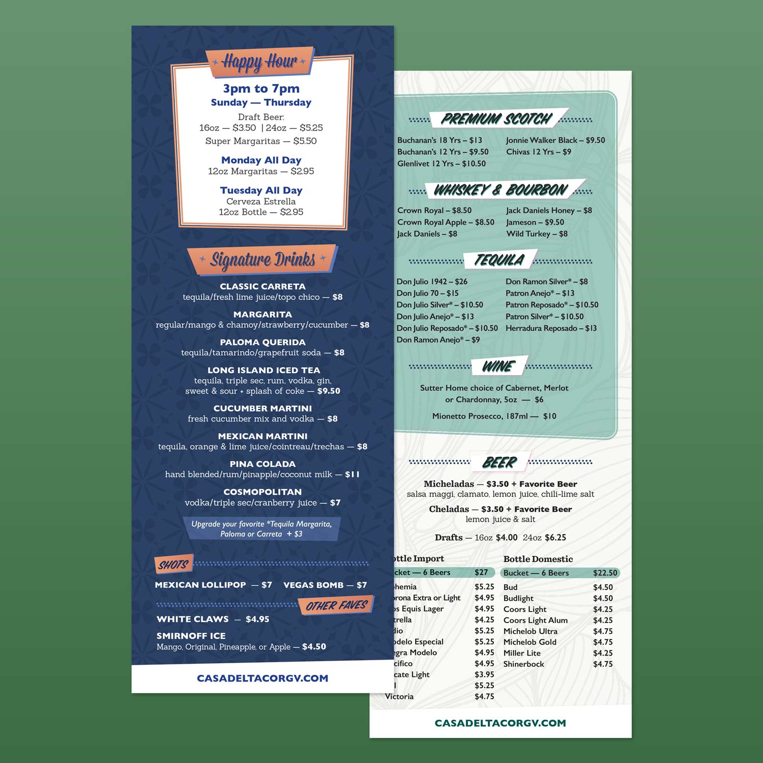
Thoughtfully designed marketing materials that reinforce your brand across touchpoints — from brochures and flyers to presentations and ads.
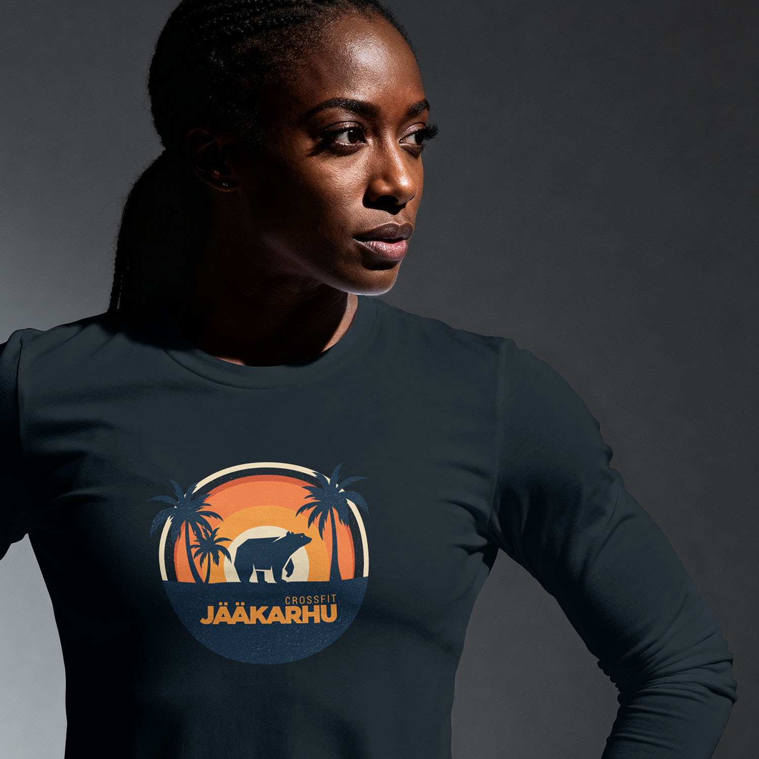
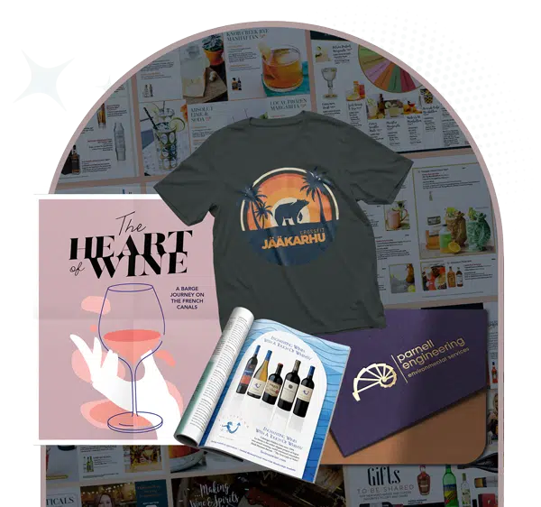
Brand-aligned merchandise and campaign creative that feels intentional and elevated.

We establish goals, audience needs, and brand direction.
Creative concepts that balance business objectives and brand personality.
Polished visuals rooted in strategy and crafted with purpose.
Assets delivered with guidance and flexibility for future growth.